Since I was young I have had an obsession with posters and flyers mainly from concerts that I had been too. It was a visual representation of the nights sonically crafted events. Some shows are so good you need to walk away with some tangible artifact to carry the memory far after you gone home for the evening. When I was first venturing down into the city to see local bands play at 15 or 16 years old, I did not have money to buy merch. I maybe had enough to pay the door entry and get a soda, so collecting flyers from shows was my way of bringing a piece of the show home. As I got older and dove deeper into the art world I became more appreciative of the artistic side of the Poster. I studied not just posters designed for concerts but posters for all manners of things; films, operas, plays, propaganda, and many other applications. This list is a collection of some of my favorite poster designs ranging from contemporary artists living and working today to artists that have been long gone but revered for their contributions to the Art of the Poster. Enjoy.

–
Something straight out of an acid trip this poster has been one of my favorites for quite some time. From what I gather, placed upon the central figures head is possibly a cluster of mushrooms that subjectively represent 2 entangled lovers that lay at the base of a massive castle-like structure encased in darkness and madness. Now, I haven’t yet seen this film but based on it’s description of it being a Psychological Horror I’d say the imagery portrayed here hits the nail on the head.
See more of Karel Tessig’s work here: www.jozefsquare.com

–
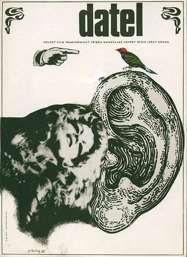
Another Karel Teissig piece, because why not. Teissig has an amazing amount of work that makes it very difficult to pick just one favorite. This piece in particular strikes me due to it’s simplicity and use of multiple medias. The overall choice of composition and color choice immediately had me thinking this would make for a great post-punk LP cover. The way the woman’s head is in focus yet from her neck down a ghostly fog leaves room for the imagination to play.
See more of Karel Tessig’s work here: www.jozefsquare.com

–
This piece was created by Henry Van De Velde during the German Art Nouveau movement of the late 19th century. Van De Velde is most notably known for his ceramic wares, furniture design and his architecture, but he also dabbled in painting and printmaking. What immediately drew me to this design was the use of concentric lines bordering the main title. I have had a long running obsession with the use of concentric lines in my own work to help represent unknown thoughts, resonations of sound, and a few other conceptual ideas. This design represents the ever classic flow of the art nouveau movement. I’ve stared at this poster for quite sometime trying to pull some sort of tangible imagery from the central flowing elements, but alas that is why it intrigues me.

–
Starowieyski is a legend as far as I’m concerned. His work is vast and covers so much ground. So, I’ve included two of his works in this list but in no way are they the end all of my favorites by him. I fell in love with this poster for it’s use of negative space to float the rib cage in the dark void as well as seamlessly mixing the use of, what I believe to be, photography and traditional drawing/painting materials. Also, the decision to not fully render where the figures head and speech bubble meet shows restraint and the skill of a master.
See more of Franciszek Starowieyski’s work here: polishpostergallery.com

–
This piece ultimately speaks for itself, but I must say that the use of loose sketched light lines being refined with slightly more refined darker lines speaks to my love of both structure and chaos. Starowieyski use of his simplistic hand drawn typefaces in all of his works is truly something I love. In it’s essence it’s punk, it’s free will, and it does it’s job well. The mutantistic mass of eyes, skin, and wrinkles makes this piece one that can be stared at for a long duration without disinterest quickly coming over the viewer pulling them away to the next quick fix of dopamine. Starowieyski hails! Go look at more of his work.
See more of Franciszek Starowieyski’s work here: polishpostergallery.com

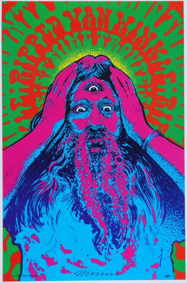
This poster was produced by Victor Moscoso to promote The San Francisco Mime Troupe’s 1988 production of “Ripped Van Winkle”, written by Joan Holden and Ellen Callas, in the SF Bay Area. First Printing Tour Blank Poster (produced without the venue lettering). Black Inkworks printer’s union logo “Bug” at lower right corner.
–
A god amongst the psychedelic scene of the late 60’s, Victor Moscoso’s work is deeply ingrained in the history of this era. The use of making a hand drawn typeface into both a visual element and the central information for the piece is amazingly displayed here. When seen one way it’s merely a tripped out halo pulling the viewers focus into Mr. Ripped Van Winkles three eyed gaze and on the other it’s pertinent information about the event it’s assigned to. Another large reason I dig this poster so much is that even though there is so much color going on it all works so well together. That’s what the artists of the psychedelic 60’s did so well. Perfectly blended over-stimulation.
See more of Victor Moscoso’s work here: trps.org

–
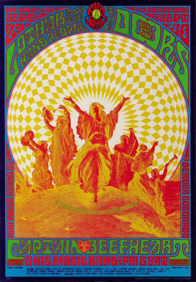
Another classic of the Psychedelic 60’s. Bob Schnepf was another big player in the poster scene. This poster design is, in my eyes, one of the more iconic designs of the era. The central duo-tone elements are so visually enthralling it instantly became one of my favorites. It screams joy and mirth drenched in acid all rolled into one event. A posters job is to pull you into making you give your full attention. If I was alive when this was on the streets I would immediately have to attend this jamboree.
See more of Bob Schnepf’s work here: www.classicposters.com

–
Power. This poster screams power. Whether it be the futuristic electricity that arcs or the strong female presence, with chin held high. The total design is successful in its application. What I love most about this design by, world renowned designer Roman Cieslewicz, is the fact that it is not clean, it’s gritty, it’s raw, and it’s alive. Someday, I would love to have a framed copy of this hanging in my home.
See more of Roman Cieslewicz’s work here: www.artnet.com

–
Oh no! The Reefer is coming to hypnotize your children and destroy civilization! How can you go wrong with this amazing example of uneducated fear, and that rainbow roll is on fire to boot. This poster is a must in any poster collectors hoard with it’s amazing use of bold fonts and simple visual elements as well as a catch phrase like, “A Puff, A Party, A Tragedy”. Plus, I always got a kick out of the spelling of Marihuana. Go chase those ‘Wild-Mad Thrills y’all.

–
This poster has so many facets I love about it from the completely bad-ass typeface to the beautifully muted choice of colors and of course the use of subtle contrast all throughout. Though the arrows fly all around and the seemingly endless fighting rages on Joan of Arc stands tall looking up to her God who guides her. Taking subject matter like blood thirsty war and making it whimsical and soft isn’t easy to do. Hats off to you Eugene Grasset.
See more of Eugene Grasset’s work here: www.artsy.net

–
It wasn’t too many years ago I discovered the work of Detroit, MI. based illustrator, Jason Abraham Smith, also known as Lurk & Destroy, but damn did I latch on to it. I currently personally own 2-3 of his screen printed posters and I have definitely had a few sessions of staring at them to break down his process and use of color. He is excellent at picking a limited color palette and by way of transparency he pushes out more colors than you’d think. Plus, his imagination and line work are top tier. Speaking specifically about this Mr. Gnome Tour Poster, Smith uses the cream color of the paper as the highlights, a dark blue for the line-work, then overlays a lighter blue and red to create the purple and then two, not just 1 but two beautifully executed gradients. One of which is the red to orange of the figures clothing and then the blue to green for the fur coat and unicorn dog. His process and application are phenomenal.
See more of Jason Abraham Smith’s work here: www.lurkanddestroy.com

–
I couldn’t just pick one piece from Jason Abraham Smiths’ work for this list. So, I give you this intense madness of color and debauchery created for an equaling intense band, Child Bite. I love that the main focus is not the information for the show but for the artwork itself. This is the height of Smith’s wild side. Packing all manner of crazy content in and no inch is spared.
See more of Jason Abraham Smith’s work here: www.lurkanddestroy.com

–
Here is a piece from another Detroit, MI. based artist, Craig Horky. Horky loves surgically mashing together animals to form creatures of your nightmares. One of many things Horky is skilled at, is his attention to detail especially his line-work and his fine stippling skills. This piece, created for super-group Corrections House, is an excellent specimen from this artist. Displaying his iconic use of a three headed animal as well as a few extra eyes to up the freak factor. I, in fact own an original print of this poster and let me tell you it’s a great work of art to have in your office. Especially because he used gold ink to add an extra flare to the finished product.
See more of Craig Horky’s work here: craighorky.storenvy.com

–
South African artist, Simon Berndt has a seemingly endless amount of work out in the world, especially in the gig poster realm. He has done work for a large list of well known acts ranging from Hawkwind, Thee Oh Sees, The Brian Jonestown Massacre, The Black Angels, Witch, and many more. One of my favorites of Berndt’s work is this amazing design for UK’s shoe-gaze frontiers, Slow Dive. This is also another piece I have in my personal collection and the craftsmanship is top notch, it also helps that I am in love when a poster artist uses smooth large gradients/rainbow rolls.
See more of Simon Berndt’s work here: 1horsetown.co.za

–
Last but not least, I give you this surreal out of this world work by Jaime Zuverza. Yes, I also own an original print of this as well. When I see works of beauty, I have to have them and this piece seems to pull from so many inspirations I connect with; Dali and Bosch to name a couple. Upon researching more work by Zuverza, I have seen that he must have crazy dreams or regularly travels to some very strange places far in his mind because he has no shortage of wildly imaginative imagery. His use of both simplistic shapes, subtly placed fine details, along side his vast knowledge and use of color make him one of my favorite contemporary artists working today. Do yourself a favor and go find more of his work.
See more of Jaime Zuverza’s work here: www.zuverza.com
Thank you very much for reading or just scrolling quickly through. Go forth and search more amazing poster art and fight the disease of mediocrity!

